Following on from my previous post on building The Burrito Bot, I want to delve into visualisation of vector embeddings that were generated from the restaurant data pulled from Google Maps.
Those embeddings had 1536 dimensions, each dimension corresponding to an axis within a high dimensional space, with embeddings that have similar meanings grouped together in that high dimensional space.
1536 dimensions…is a lot of dimensions! And for me, a hard concept to get my head around. It all just feels so abstract (to me anyway), I want to see what they actually look like!
Thankfully, there’s a website out there that can help us visualise embeddings: –
https://projector.tensorflow.org/
So let’s have a look at visualising some embeddings!
In the github repository for the Burrito bot, there are two folders under: –
https://github.com/dbafromthecold/burrito-bot/tree/main/Data/Visualise%20Data
Embeddings One contains two tsv files…this is the first set of data that I used for the bot. It contains embeddings based on the following values: –
Name
City
Rating
Reviews
Address
PhoneNumber
The embeddings.tsv is the actual embeddings generated from the model, tab delimited. The restaurant_metadata.tsv is the data (listed above) that was sent over to the model to generate the embeddings (again, tab delimited).
Click Load on the left hand side and load embeddings.tsv for Step 1 and restaurant_metadata.tsv for Step 2.
And this is what’s produced!
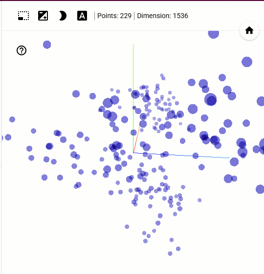
We can clearly see clumps of embeddings grouped together! Clicking on an embedding will show the data it contains and also the nearest embeddings to it…calculated via Cosine or Euclidean distance. Notice that the nearest “dots” on the map may not always be the ones highlighted via the distance calculations.
This is because the original embeddings exist in 1536 dimensional space, whilst what we are seeing is a 3D projection of that space. Reducing 1536 dimensions down to 3 cannot perfectly preserve every distance and relationship, so some points may appear closer or farther apart than they are in the full embedding space.
Ok, so what about the review data that I ended up using for the bot?
That’s in the second folder (Embeddings Two) …if we load that into the site, we get: –
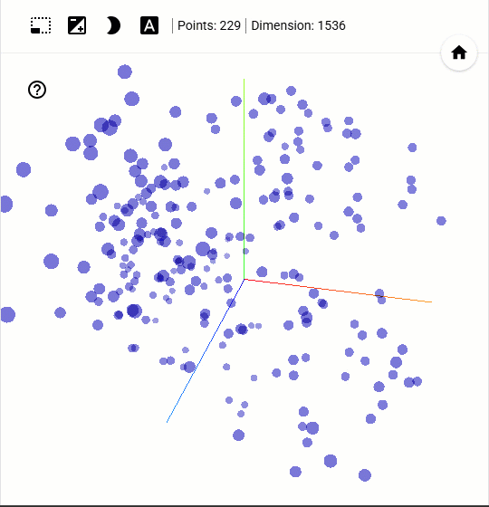
Not so obvious grouping this time…but there are still clearly some smaller groups there and we can use the site to see the review data (click on the “dot”) to potentially work out why they are clustered together!
I found this site to be really useful in getting my head around visualising embeddings…hope it helps you too!
Thanks for reading!
